Ana de Macedo is a systemic therapist based in the Algarve, Portugal, who also works with clients online. Her practice, Body Portal, listens to the body: through movement, memory, drawing and creative expression, she helps people uncover inherited family patterns and gently break cycles that have been carried for generations.
We designed and built body-portal.pt to feel the way a session with Ana feels: calm, warm and unhurried. This is how we approached it, and what we would suggest to any therapist planning a new website.
The Brief
Therapy websites have a harder job than most. The person landing on the page is often anxious, unsure whether this kind of therapy is for them, and wary of anything that feels like a sales pitch. At the same time, the site still has to explain an approach that many visitors will never have heard of, set out several very different ways of working together, and get people to take a first step.
Ana works in three ways: one-on-one sessions (online or in person in the Algarve), group programmes that run for three, six or nine months, and six-day retreats in nature on the Algarve coast. Every one of those paths starts in the same place, with a free 30-minute consultation. The site needed to make that obvious without ever pushing.
Our Approach
Design that slows the visitor down
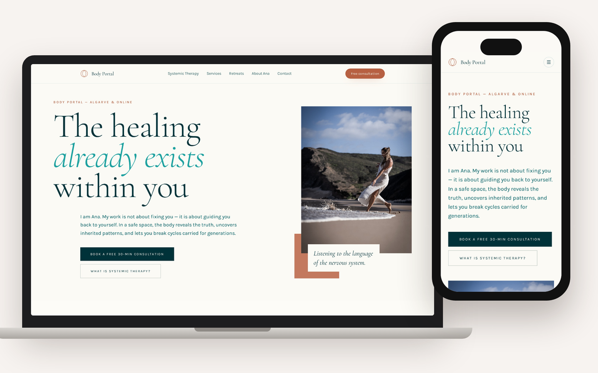
The visual direction came straight from the work itself. We used Ana's own photography rather than stock, an editorial serif for headings, generous white space and a soft palette drawn from the Algarve: sand, sea and a warm terracotta accent. The homepage opens on a single line, "The healing already exists within you", next to a photograph of Ana at the water's edge.
Nothing on the page competes for attention. For a therapist, that restraint is part of the message. A visitor should be able to read the homepage and feel something of what it is like to be in the room.
One clear next step on every page
This was the most important structural decision. Every page ends in the same place: Book a free 30-min consultation, which opens Ana's booking calendar so people can pick a time without an email back and forth. A free consultation button sits in the header on desktop, and the booking link appears again through and at the end of each page, so it is never far away.
Anyone who would rather ask a question first can write to Ana directly from the contact page. That is offered as a quiet alternative rather than a second competing goal.
Keeping one primary action is something we push for on almost every project. When a page asks visitors to call, email, follow on Instagram, sign up to a newsletter and book, most people do none of those things. We wrote more about this in why your website is not generating leads.
Explaining the approach in plain language
"Systemic therapy" is not a term most people search for with confidence, so the site explains it before it asks for anything. A dedicated Systemic Therapy page covers three foundations (mind and body as one system, following the root rather than the symptom, and patterns that were never yours), then walks through what actually happens in a session: you arrive, the body leads, you follow it together, and you integrate.
The homepage repeats this in miniature as "the pathway": a free consultation, then gentle movement and a few questions, then an invitation into the work if it feels right. A first-time visitor knows exactly what will happen before they book, which removes a lot of the anxiety around making contact.
Three doors into the same room
The services page sets out all three ways of working with Ana side by side, with prices shown openly: single sessions and session packs, the three group programmes, and the retreats. Each card ends with a route back to the free consultation, because that is where Ana and the client decide together which path suits them.
Publishing prices was a deliberate choice. For a considered purchase like therapy, people want to know what they are committing to before they make the first call. Seeing the numbers early filters out poor fits and saves both sides an awkward conversation.
The retreats have their own page with the shape of the six days, what is included and the house where guests stay, plus a newsletter sign-up for people who want to hear about future dates first. It is the same pattern we used for the Sister Space retreat website: make the experience concrete enough that people can picture themselves there.
Ana's own voice
The copy is written in the first person, in Ana's voice. Her about page explains how she came to the work through her own body, and how she works in practice: few questions, close listening, sometimes movement, sometimes drawing. Short quotes from Ana run through the site to break up the longer sections.
For a one-person practice, the person is the brand. A visitor is deciding whether they trust Ana, not a logo, so we gave her room to speak.
Built for search from the start
Each page has its own title, description and heading structure, written around how people actually look for this kind of help: systemic therapy in the Algarve, online sessions, retreats in Portugal. The basics are covered in our guide to SEO basics for small businesses. The site is fully responsive too, which matters when many visitors will first find it on a phone.
What Ana Got
- A calm, editorial website that reflects how she works, using her own photography
- A single, consistent next step on every page: a free 30-minute consultation booked straight into her calendar
- A clear explanation of systemic therapy for people who are new to it
- One place for one-on-one sessions, group programmes and retreats, with prices published
- A newsletter sign-up for people who are not ready to book yet
- A clean SEO foundation for local and online searches
The site has only just launched, so we are not going to quote results yet. What we can say is that the structure is set up to make the first step as easy as possible, which is where a therapy practice wins or loses most new clients.
What Other Therapists Can Take From This
If you are planning a website for a therapy, coaching or wellbeing practice, these are the decisions that made the biggest difference here:
- Pick one primary action and repeat it on every page. For most practitioners, that is a free or low-cost first conversation.
- Explain what happens next. A short, step-by-step description of the first session lowers the barrier more than any amount of persuasive copy.
- Use your own photographs. Stock images of smiling people on sofas tell visitors nothing about you.
- Write in your own voice. People are choosing a person, so let them hear you.
- Be open about price where you can. It builds trust and saves time.
Frequently Asked Questions
What should a therapist's website include?
At a minimum: a clear explanation of how you work, who it is for, what a first session looks like, your services and prices (or a starting point), an about page in your own voice, and one easy way to book a first conversation. Everything else is optional.
Should therapists show their prices online?
There is no rule, but for considered services it usually helps. Visitors who can see the cost upfront arrive at the first call already comfortable with it, and those for whom it does not fit can move on without an awkward exchange.
Can you build a therapist website in English and Portuguese?
Yes. Many practitioners in the Algarve work with both local and international clients, and we regularly build multilingual sites. See our web design and development service for how we work, or web design in the Algarve if you are based locally.
If you run a therapy, coaching or wellbeing practice and your website does not yet feel like you, get in touch. We will tell you honestly what we would change.
Visit the live site: body-portal.pt
Want similar results for your business?
Let's discuss how we can help you achieve your goals with a custom solution.
Start a Conversation